2018 Capital FC Half Marathon
In the 2018 edition of the CFC Half, I took a larger role in the organization and marketing.
I started last year on race day when I made a quick list of how the race branding could be improved or expanded.
Logo
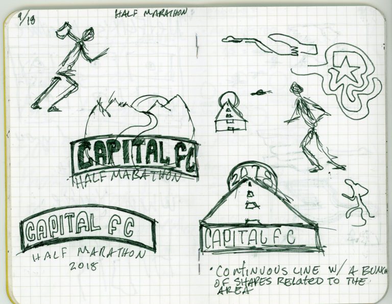
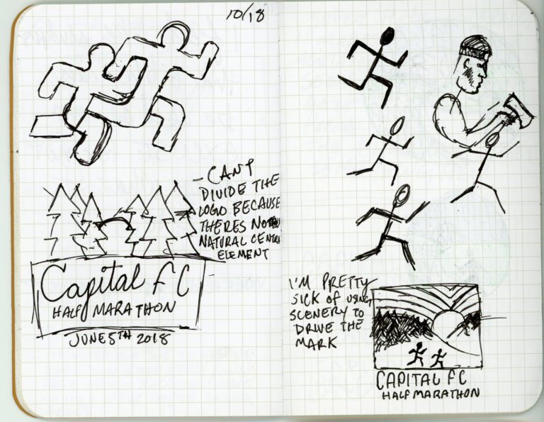
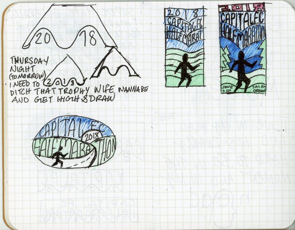
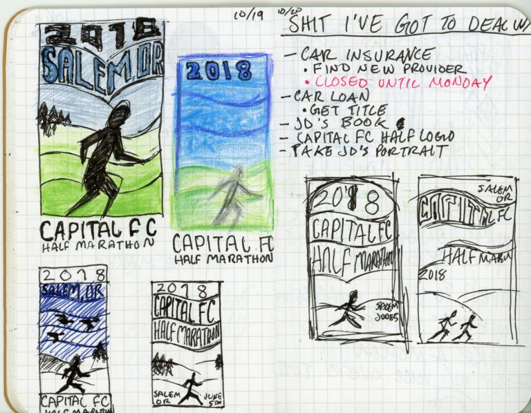
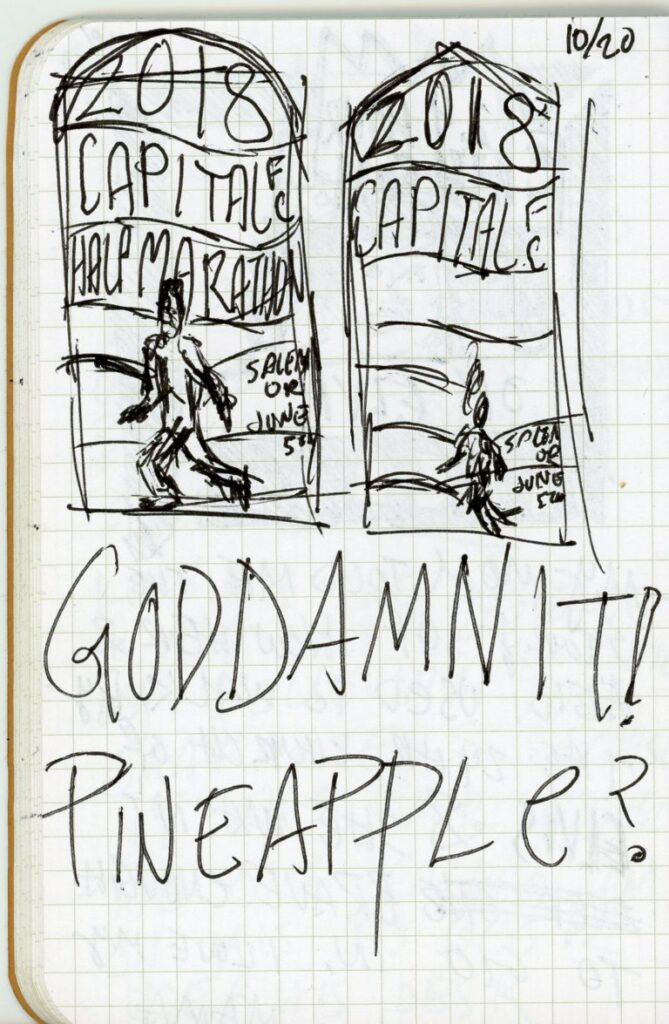
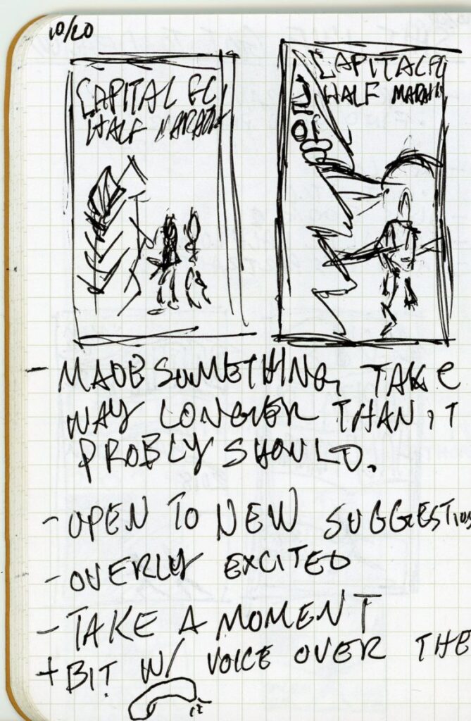
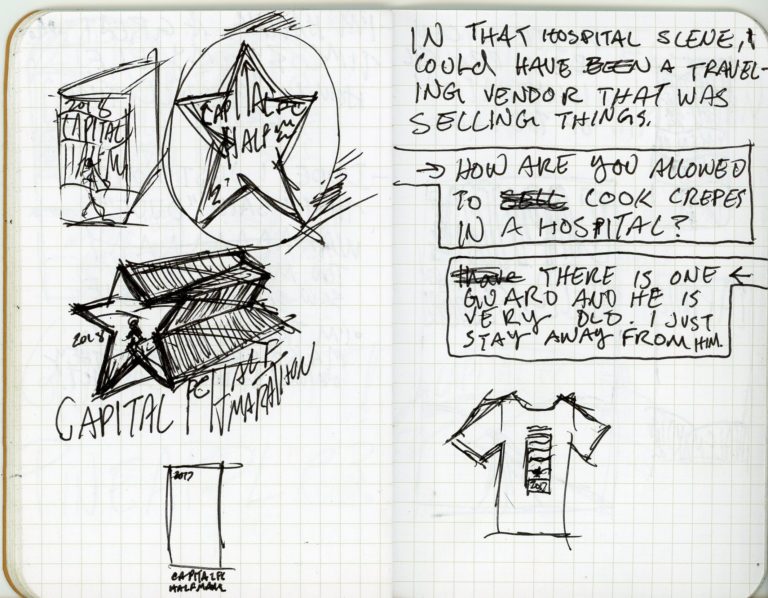
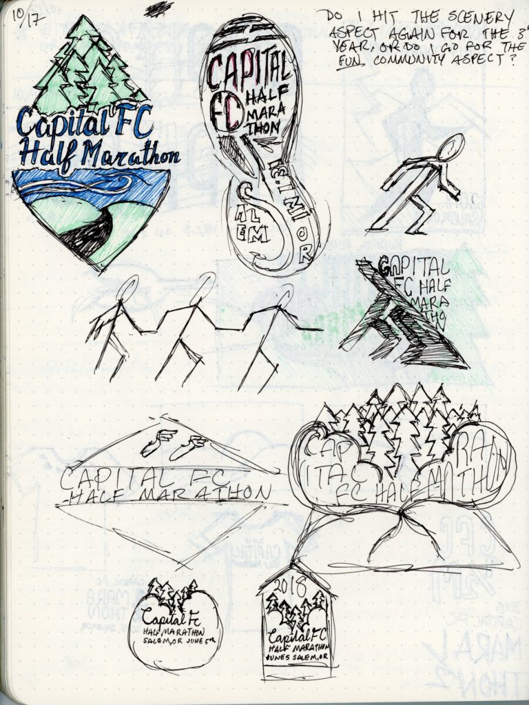
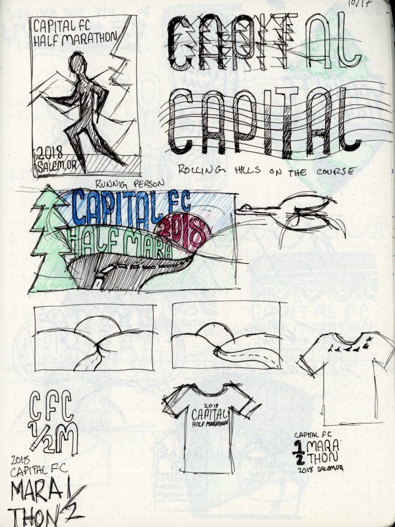
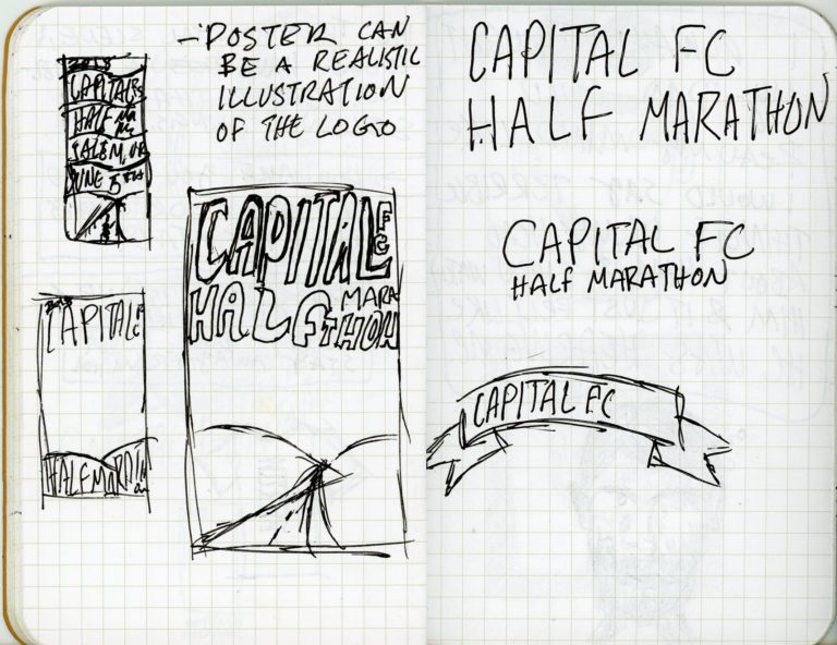
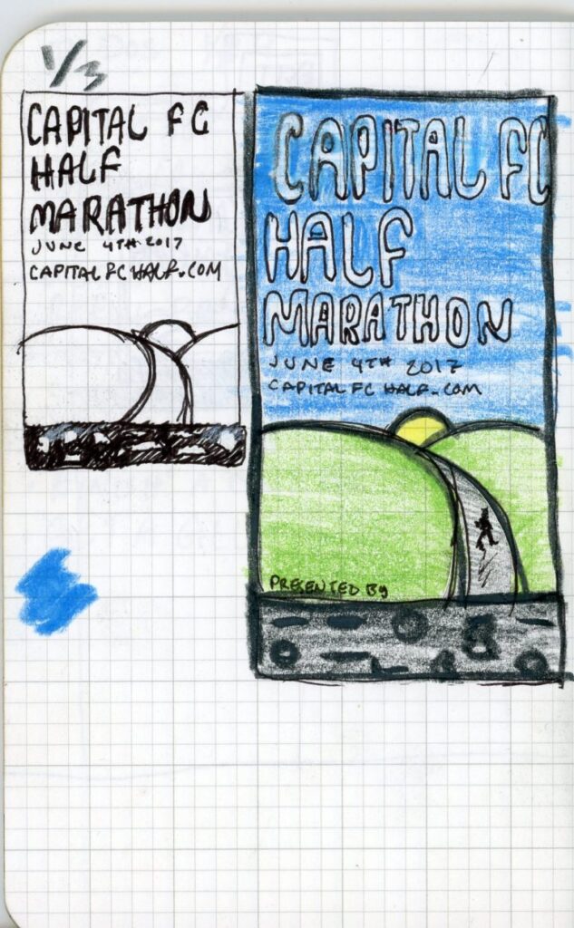
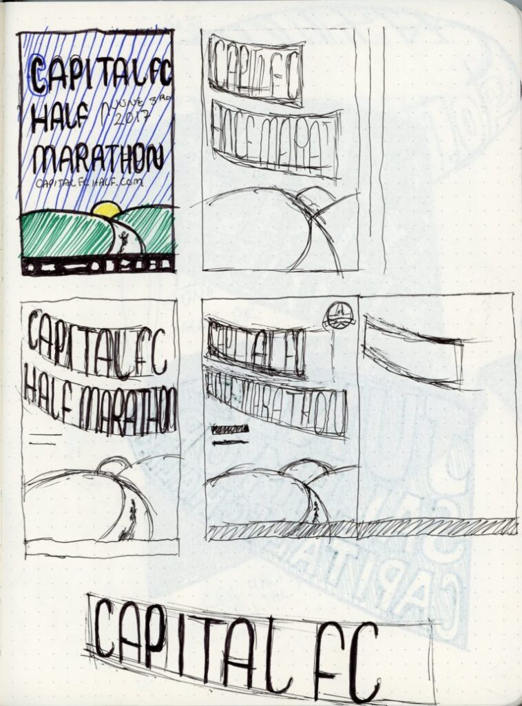
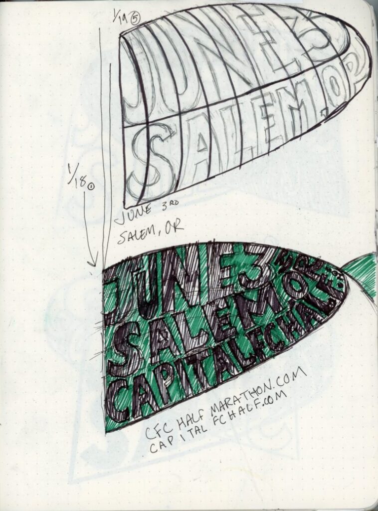
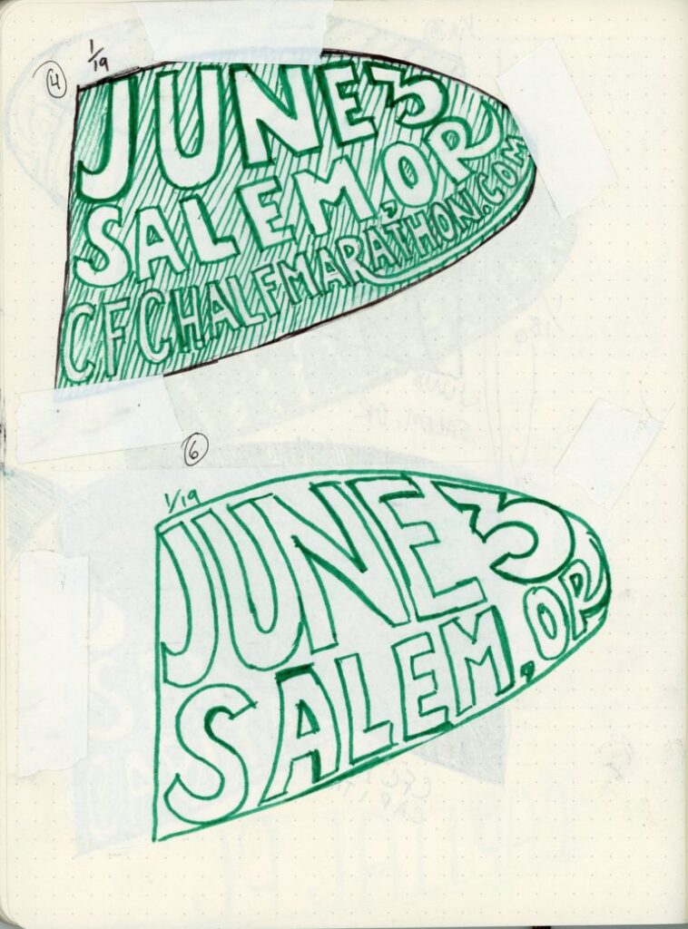
My process always starts in my sketchbook sketching out a logo. Looking back now, I notice that the detail in my sketches is anything but linear. I’m really just trying to get enough information to myself later that I can use to move forward.
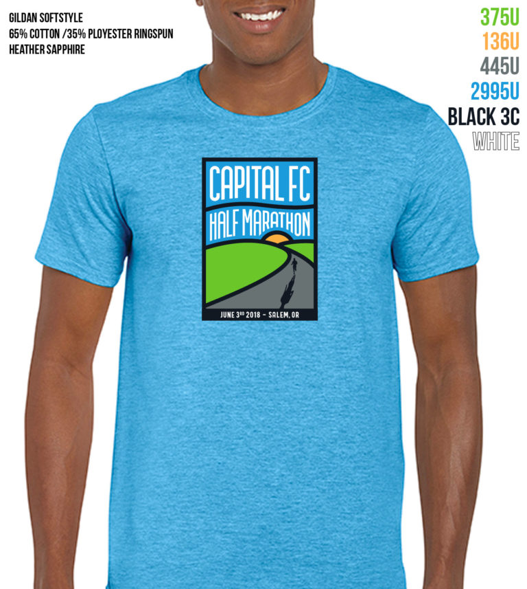
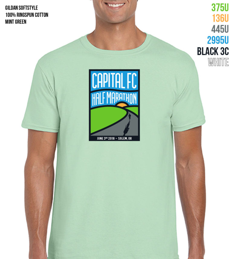
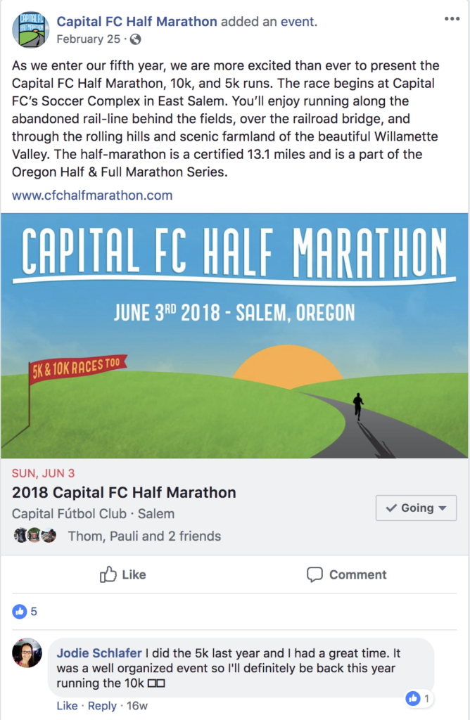
I knew the logo had to work in a single color and as a frame for a color coding system. What I came to was something reminiscent of a stained glass window. The overall visual was just as important as what was coming through the frame.
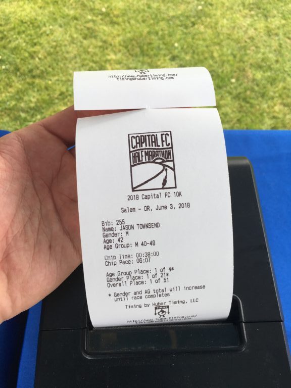

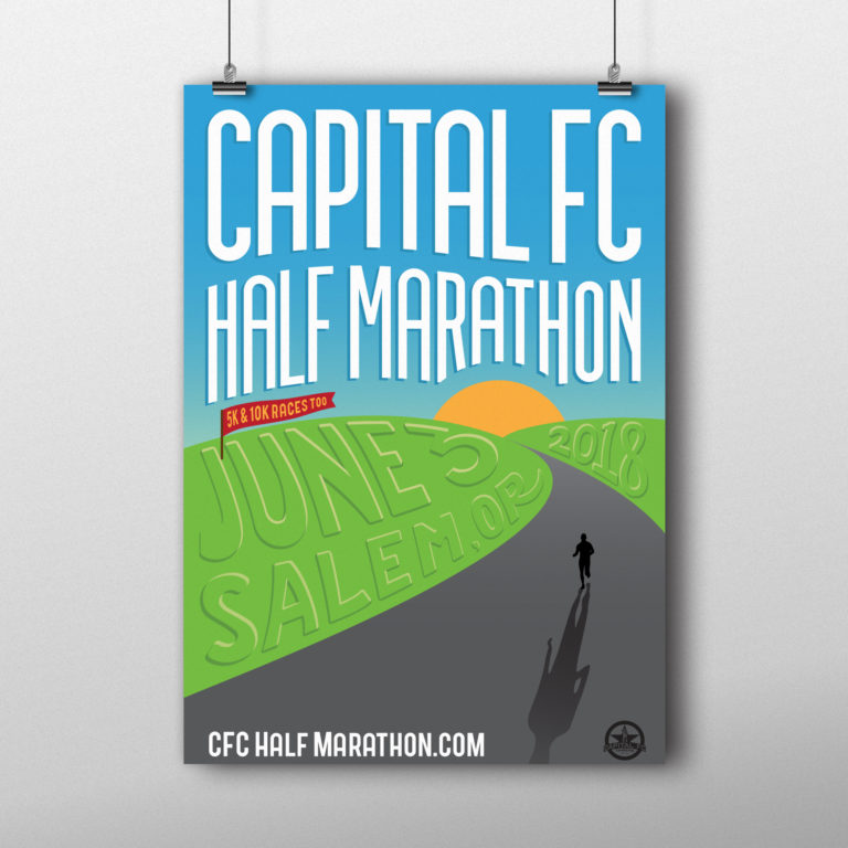
Poster

Bib Numbers
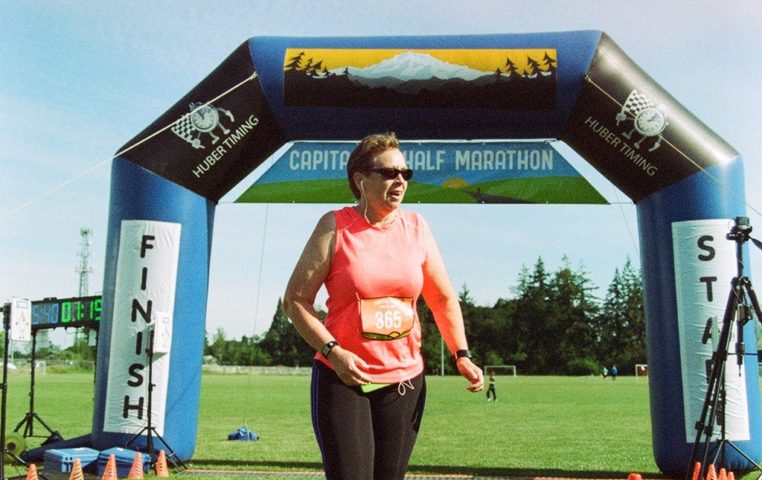
Orange Bib: 5k 
Purple Bib: 10k 
Blue Bib: Half Marathon
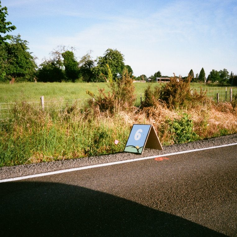
Mile Markers
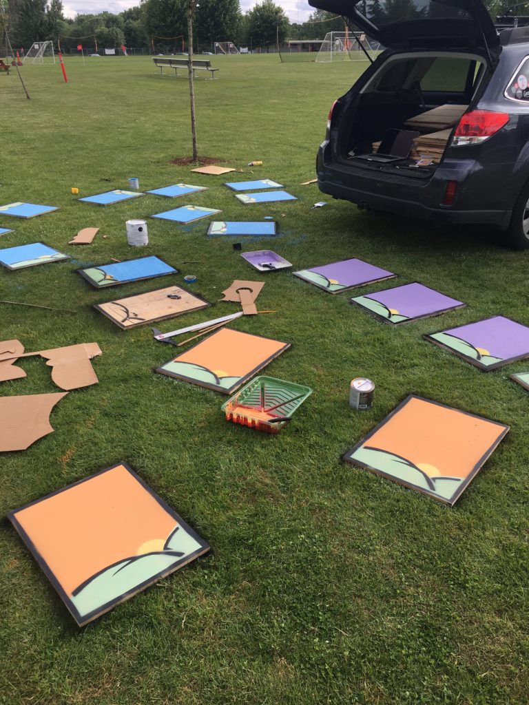
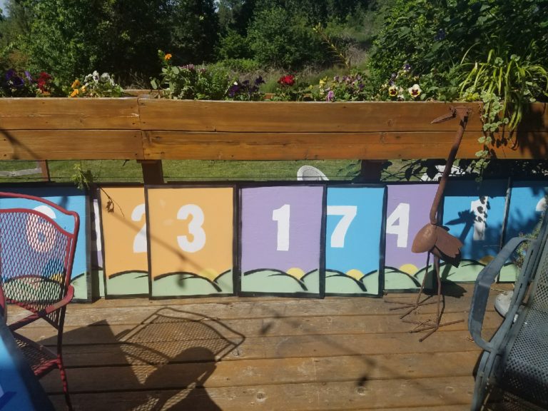
I wanted the mile markers to be reminiscent of the family farm signs out on the course. Because I focused on making a strong visual shape, the branding was pretty easy to adapt to this new format.

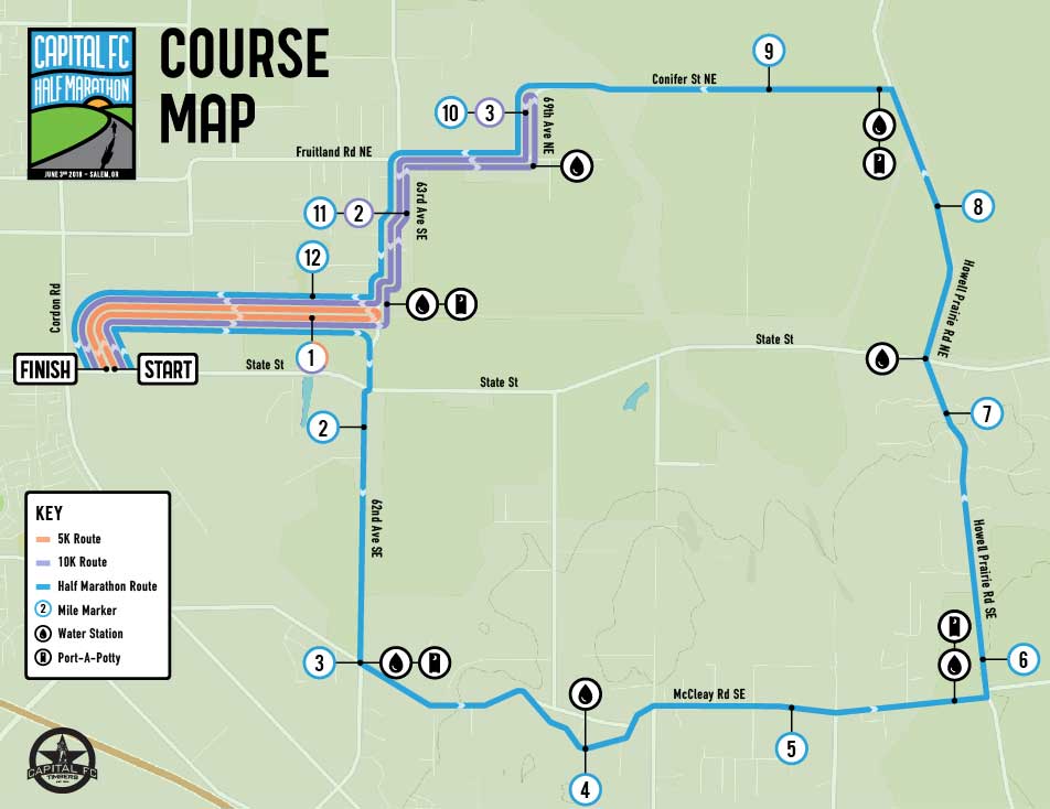
Map
Because the map was part of the way finding process, the color coding needed to extend to the course routes.
