Fpweb Icons
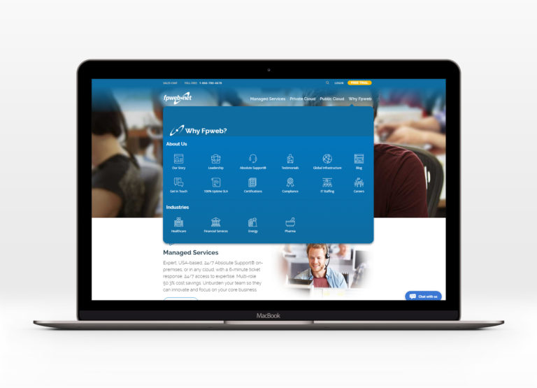
When I started at Fpweb, I was a little overwhelmed with just how many services they offered, and because I was now in charge of the website, I was able to display those services in a way that made the most sense to me. First, I started by turning their 5 different dropdown menus into one mega menu.
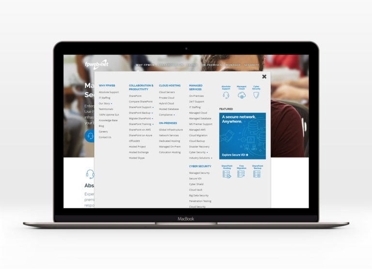
But it didn’t take much time for us to add more services that would ultimately make this version feel overwhelming. My next course of action was to silo the services we offered, and give users a sense of what each service was if they didn’t recognize the name. That meant creating icons for each one of our services.
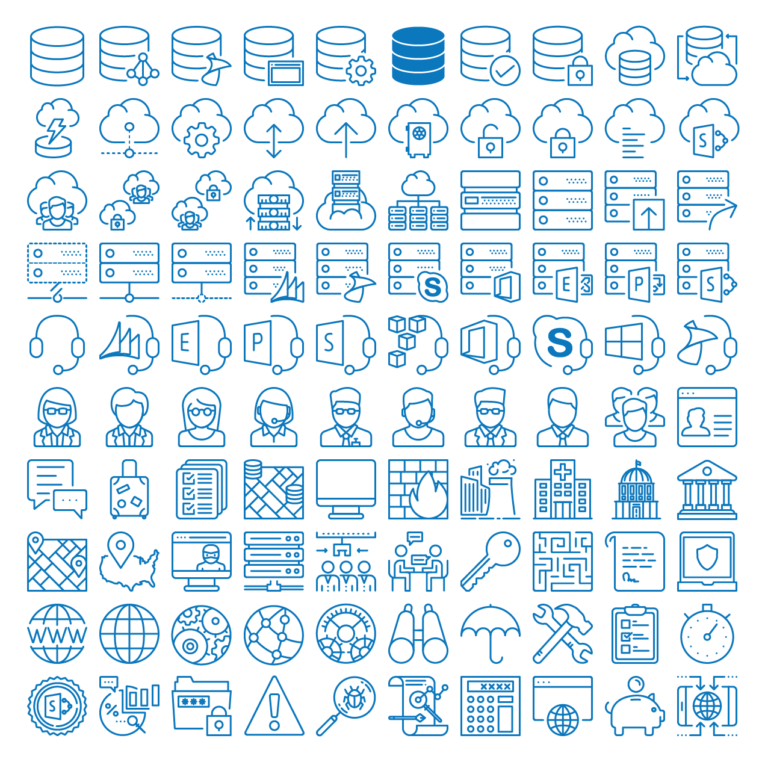
Because tedious detail heavy work is kind of my jam, I set up 100 100px x 100px illustrator artboards and put my guides 3px away from the each edge of every artboard.

Then I created some standards for the icons so someone else could create new icons that matched.
- All strokes are 3px at 100px high
- Rounded caps on all strokes
- Rounded corners
- Height must be 100px
- Width should be 100px
- Type, when used, is Filson Soft Bold (outline type)
- Corner radius’ use increments of 3px
- Whenever possible use circles for curved strokes
- Gaps are 6px excluding end caps (Example below)

Then created a few digital mockups of how the new mega menus would look.



Between the digital comps and the final code, we made some changes to the way we siloed our services.
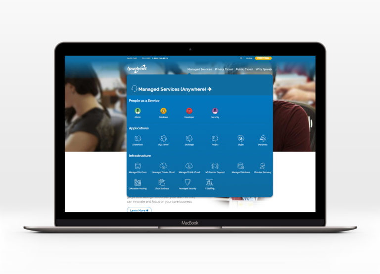
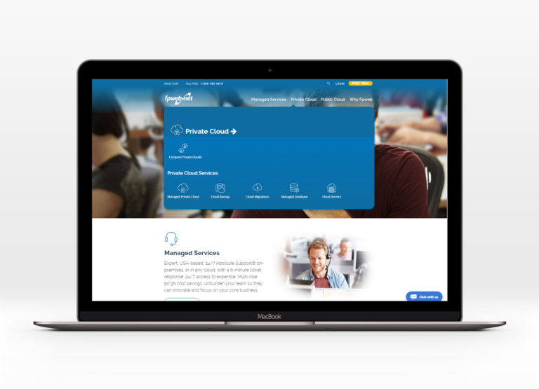
In addition to the mega menu, these icons had to work as large icons as well to help break up our enormous amounts of text.
