2017 Capital FC Half Marathon
This year’s iteration of the Capital FC Half Marathon logo was one of the most challenging experiences I’ve had as a freelance designer, mainly because I also had a full-time job that demanded my attention throughout the process. I learned a few things about the design process in this experience: first, I learned that no matter how hard I try to keep uniformity in my approach, no two projects will ever be the same, and second, that quality is the ultimate goal and sometimes you’ve got to suck up your pride, admit your mistakes, and make it right.
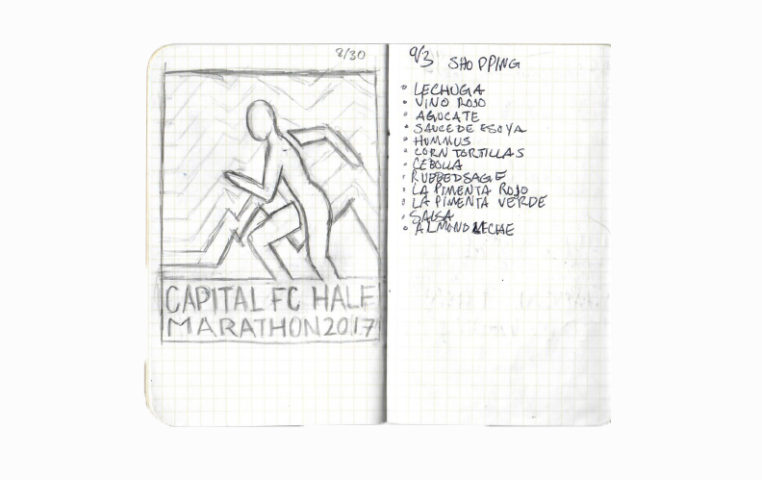
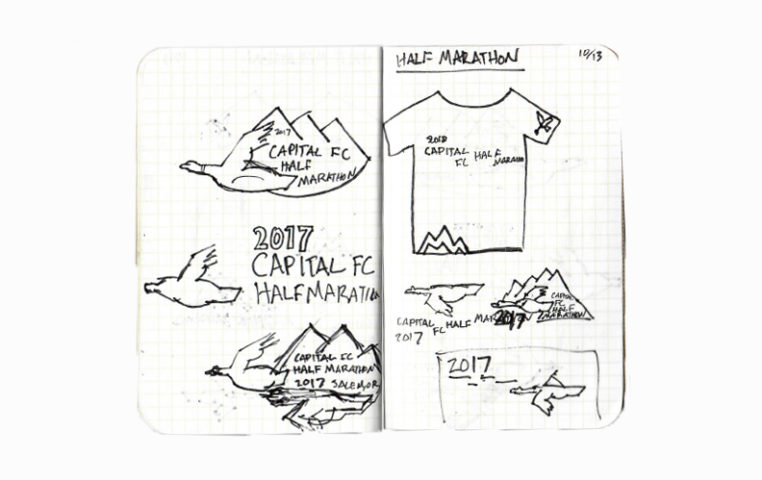
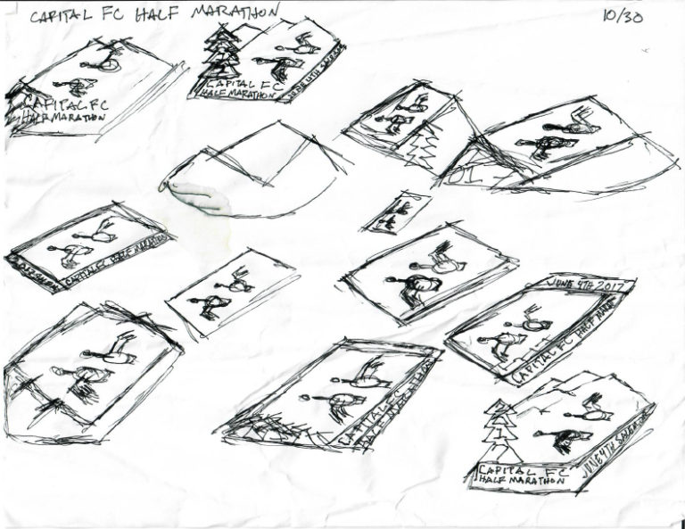
So here goes. I started, like I always do in my handy sketchbook to get some ideas down.

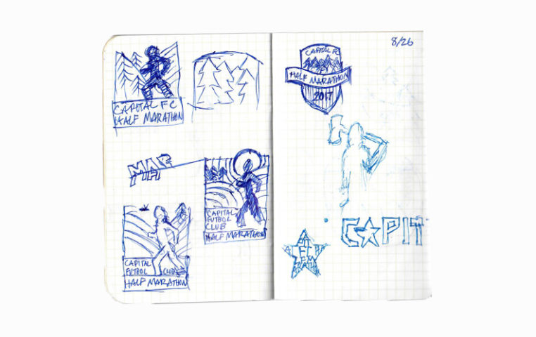
In the scan below, I went back to some of my unused sketches of geese from the 2016 logo. That ultimately turned out to be a huge mistake.
This is that sketch, and the ensuing digital illustration.
So with the thought that these geese were the dopest geese of all time stuck in my head, I kept going down that wormhole.
Sidebar the meaning behind the geese: because I grew up playing soccer at Capital FC, I am well steeped in the environmental factors that affect the club and its fields. One of those environmental factors is that durning the fall, Canadian geese come from around the world (probably) to the CFC fields in Salem, OR to have the mother of all geese gaggles. For like 4 months those fields are a total shit show, literally. These geese hang out all day on the fields distracting kids from their coaches and leaving an unfathomable amount of feces behind them. So, yeah, anyone that’s ever been to the CFC fields knows whats up with the geese, but I digress.
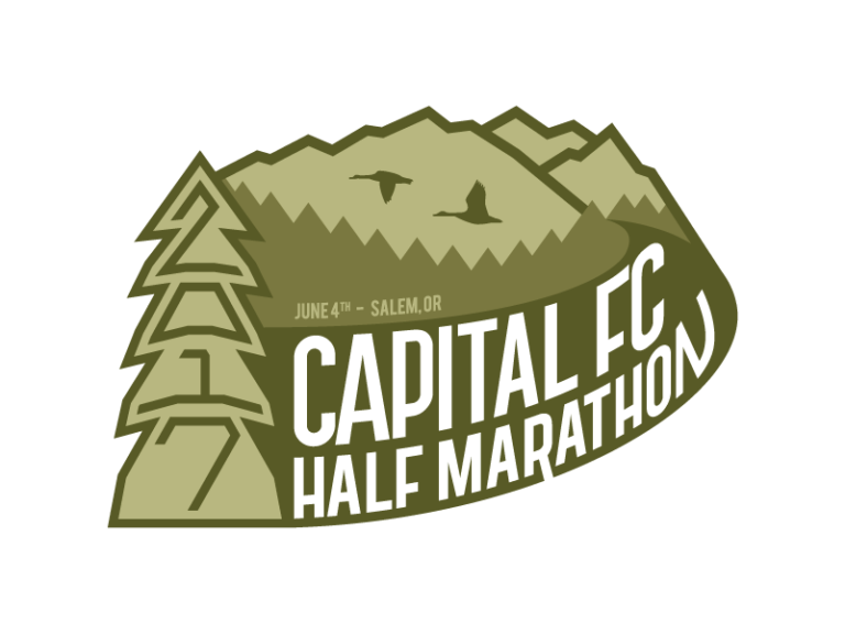
And ultimately ended here:
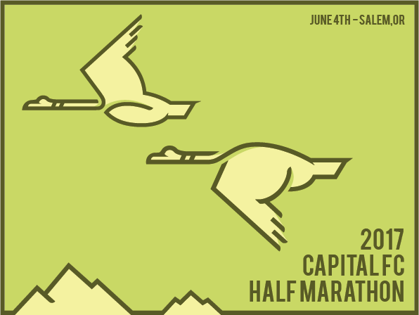
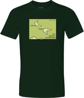
But it wasn’t until I got this logo mocked-up onto a shirt that I realized that the type was too small, the logo had too much empty space, there was no movement, and it didn’t visually say “running” at all. However, the client wanted it that day to be able to get a head start on the event, so I shipped it knowing it wasn’t good enough. This was a dark time in my career as a designer, and the fact that I shipped something I wasn’t proud of ate at my soul. So I went back to my sketchbook.
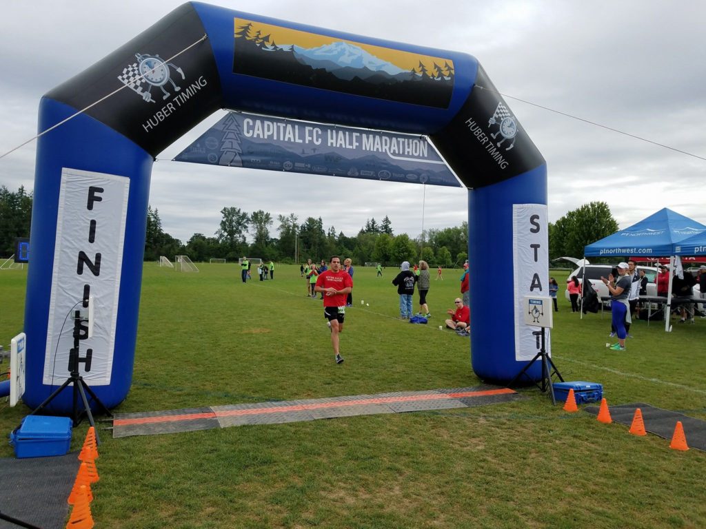
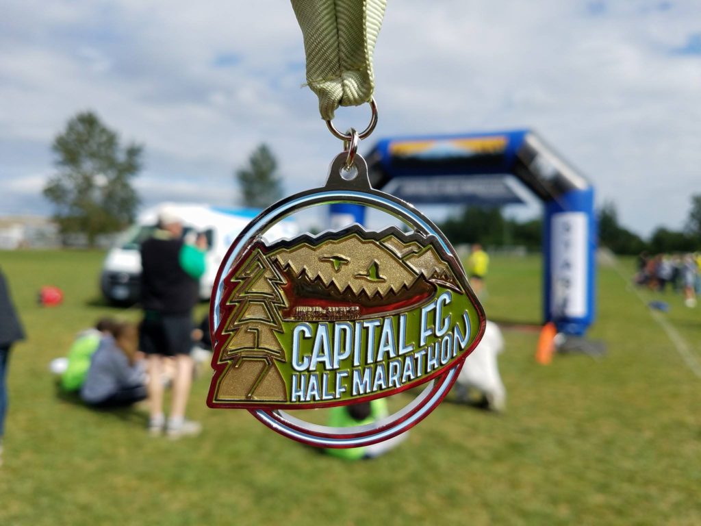
 One of the challenges of this logo is that, the race doesn’t have a huge budget, so I’ve got to design a logo that works both on a t-shirt but also on a medal. The medal is the tricky part, because all that type has to all be contained within one shape.

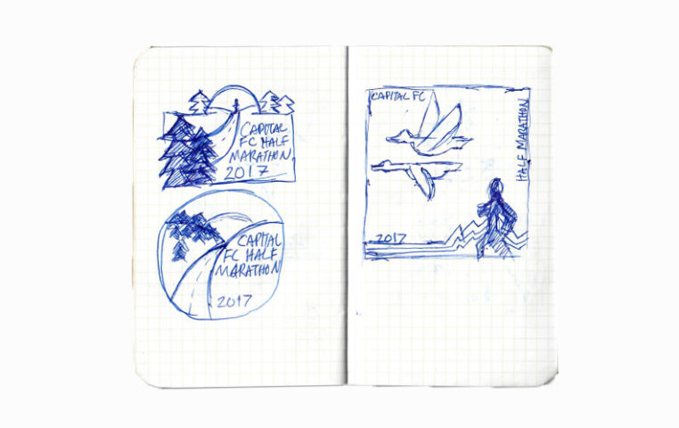
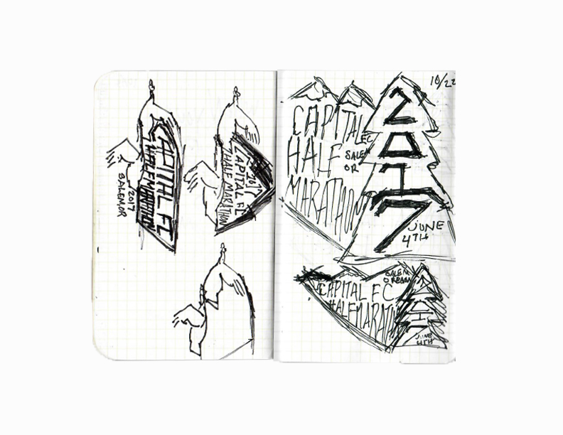
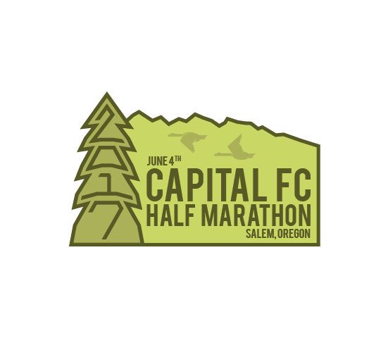
This was what I came up with at the end of my first round after my epiphany. Remember that little nugget on my first page of sketches–the date forming a tree? Well I found that and liked it, so I brought that back from the dead.

Obviously, I wasn’t ready to give up on those geese illustrations quite yet.
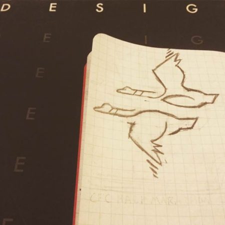
I asked one of my old Maryville professors for some notes (shouts out to Caren) and she told me that the geese were nice on their own, but distracting in the logo. So I simplified them.
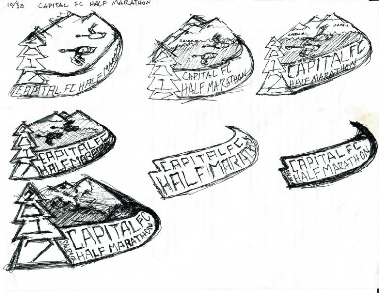
I thought this was better, but I still wasn’t happy with the overall shape the logo made, so I went back to my sketchbook again and started trying to make a more pleasing shape, and one that made sense visually–especially in the bottom right hand corner. My thinking was that I could use a road vanishing into the distance to create that shape.

Then I had to take one more pass at the damn geese.
I ran out of space in my sketchbook and moved to paper, which was where the magic really started happening.
I felt I had worked out what I needed to work out on paper at this point, so I went back to the computer.

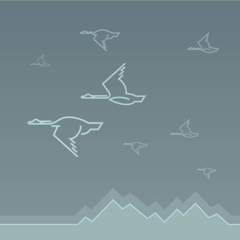
I tried a couple different color combos, “N’s” and geese styles and went back to my old professor for some more guidance. She mentioned that the geese were too detailed for shapes that should be receding into the horizon, and that the mountains could be reworked so they didn’t feel so abrupt.
I changed the “N” again, and ended here.
So this was the point in my process where I had to go crawling back to the client (who had completely forgotten about the logo because the run was still 8 months away at this point) and apologize for turning in sub-par work. They obviously weren’t expecting this and didn’t have a problem with the old logo, but they went through the roof when I showed them the new one.
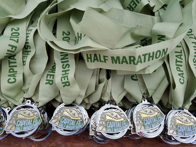
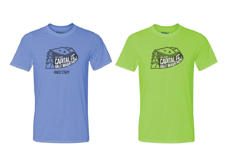
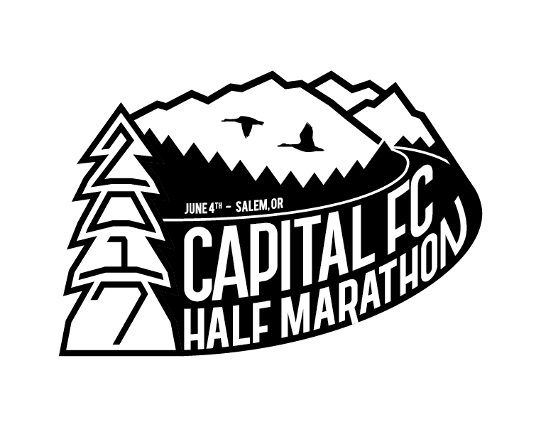
I quickly followed up with shirt mockups for runners and staff and a single color application for etching on glass.
So in closing, I learned a couple of things: 1) Don’t do shitty work. 2) If you do happen to do shitty work, fix it. Even if it’s past the deadline, do it for you. If you’re lucky, which I absolutely was, you may be able to stretch the deadline with bitchin’ work.